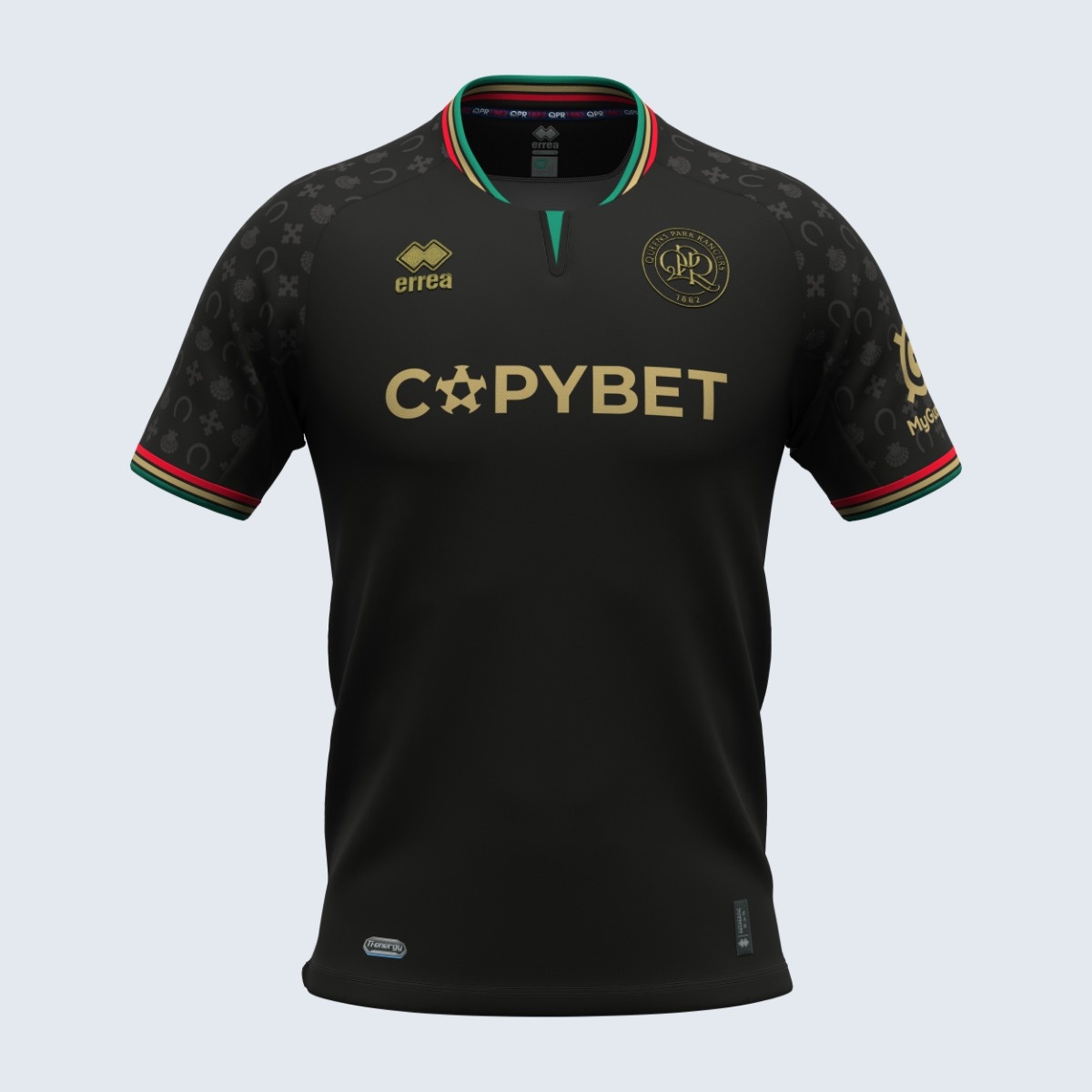
QPR's away shirt for the new season is completely new, breaking away from last year's red and black design. Elegant and meaningful, the new away kit is black with gold details, finished with thin red, gold and green striped collar and sleeve trims.
A particularly significant detail is the tone-on-tone symbols on the shoulders and sleeves. These symbols, present in the club's badge used in white on its shirts between 1953 and 1960, which was the crest of the London Borough of Hammersmith, do not only have a decorative purpose, they also aim to pay homage to QPR's roots, incorporating tradition in a contemporary design.
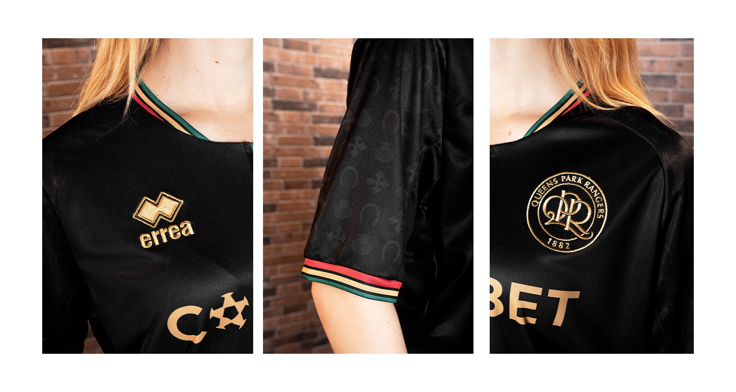
Combining historical references with a distinctive and eye-catching design, this away kit wants to be much more than a mere sports kit. It is a symbol of pride and kinship, allowing players to feel connected to the club's rich past as they face the challenges of the new season.
The shirt also has a dual-fabric construction, featuring both Ti-Energy 3.0 and Utility fabrics, which guarante excellent comfort and performance, making the shirt ideal for high-level competitions.

