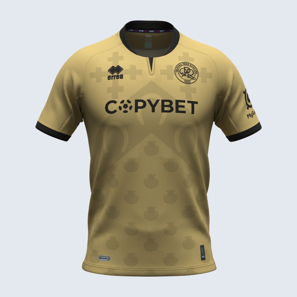


The elegant gold of QPR's unique and innovative third shirt, that adds a touch of class, marks a real change of style for the club. This sophisticated colour highlights the club's desire to explore new aesthetic directions.
An important detail that makes this kit even more special is the presence of tone-on-tone symbols, applied with care on the shoulders and sleeves. These symbols have historical significance: indeed, they are taken from the coat of arms of the London Borough of Hammersmith and used on the club's white shirts between 1953 and 1960. This detail was not only included for decorative purposes; it has a profound symbolic value. Indeed, these elements aim to pay homage to QPR's historical roots, celebrate the club's glorious past and cleverly combine historical references with a modern, distinctive and attractive design.
The trims and details of the shirt are in elegant black, creating a stylish contrast with the dominant gold and lending it even more class.
From a technical point of view, the jersey has a double-cloth construction, guaranteeing superior quality and comfort for the athletes. Two innovative materials were used: Ti-Energy 3.0 and Utility. Ti-Energy 3.0 is known for its anti-bacterial and anti-viral properties, and offers excellent breathability, while the Utility fabric ensures strength and durability while maintaining lightness and flexibility.